
Entry 1-Fallout 4 Art Book
I looked through the art book of Fallout 4 that I own. I decided that I will do a chapter every other week. The first chapter in the book is preproduction of the art in the game. Here they show their sketches and test ideas and how they developed them.
One of the main goals here was to get the color scheme much more vibrant and brighter unlike Fallout 3. They decided on going with a dark background and lighting, but then having the structures and characters pop out of it, through the use of contrast. Also everything has that texture of being rough and grimy, which helps sets the stage that the game is set in a post-apocalyptic world. Through use of unity of where everything is rusty and thrown together it gives the world and the art pieces a sense of surviving at all costs. This book is what I wish I could be doing one day, after doing this major. This is because it does the steps of design and getting ideas down, then developing them. Getting down what you want everything to look like first is the first step before the animation can happen Plus it shows how it’s fine to redo and change the little things in your ideas. Yet I still want to know was this done on a computer or by hand. This shows that sketching is an important part of getting your ideas down and designing from there and changing it as you go to get it the way you want it to look.
Citation- Pely, Istvan . Chapter 1 Preproduction. The Art of Fallout 4, Aaron Walker, First edition, Dark Horse Books, December 2015, pp. 9-52.
Entry 2- Sunday Times(1987)
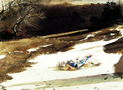
I picked this artist because I thought this is the one that we talked about. Andrew Wyeth’s artwork is appealing to me because it’s simple and straightforward. One can tell that it’s near spring time, due to the limited amount of snow on the ground. The contrast with the snow and the background draws your eyes into the newspaper that is littering the ground in the front. It’s the only thing that has bright colors to it. I started to wonder how to the paper got there if this is in the middle of no-where? The paper is the most dominant thing and is the most detailed object in the pieces, the background is just painted there with no real attention to it. The only thing that has some detail is the tree in the back left corner. It has the texture and feeling of being a tree. So with this being the case, Wyeth must have wanted the viewer to look at the newspaper closely. The brightness of the foreground fades as you go farther in the background until it turns into darkness. This piece relates to the DMA curriculum, because it shows one how to develop ways to bring the viewer into looking at what you wanted them to look at and not other things. Plus it shows how keeping pieces simple can make them look nicer in the end. A method that I will add to my process is to think of what my goal is and think about what I want as the centerpiece of my artwork and how I can achieve that first so as I am drawing I can get it right.
Citation- Wyeth, Andrew. Sunday Times, 1987, watercolor on paper. Private Collection
